
Interacting with Charts
Team Insights includes several interactive charts that help you visualise your team's delivery health. This page explains how to interact with and interpret each chart.
Chart Legend Filtering
Each chart includes a legend that allows you to toggle work item types on and off for focused analysis.
How to Use Legend Filtering
-
Locate the legend below any chart (e.g. Cycle Time Scatterplot, Throughput)
-
Each work item type is shown with a coloured checkbox and its 85th percentile value (e.g. "Task (85% at 14 days)")
-
Click the checkbox next to a work item type to hide or show it on the chart
-
The chart will immediately update to reflect your selection
-
Click the checkbox again to restore the work item type to the chart
Why Use Legend Filtering
-
Focus on specific work types: Temporarily hide some work item types to better see patterns in others
-
Compare cycle times: Isolate one work item type to see its distribution clearly
-
Identify outliers: Remove "noise" from high-performing item types to spot issues in others
-
Quick analysis: No need to apply global filters—quickly toggle views while exploring
Note: Legend filtering only affects the visual display of the chart. It does not change the insights or recommendations, which are based on the filters applied via the Filters panel.
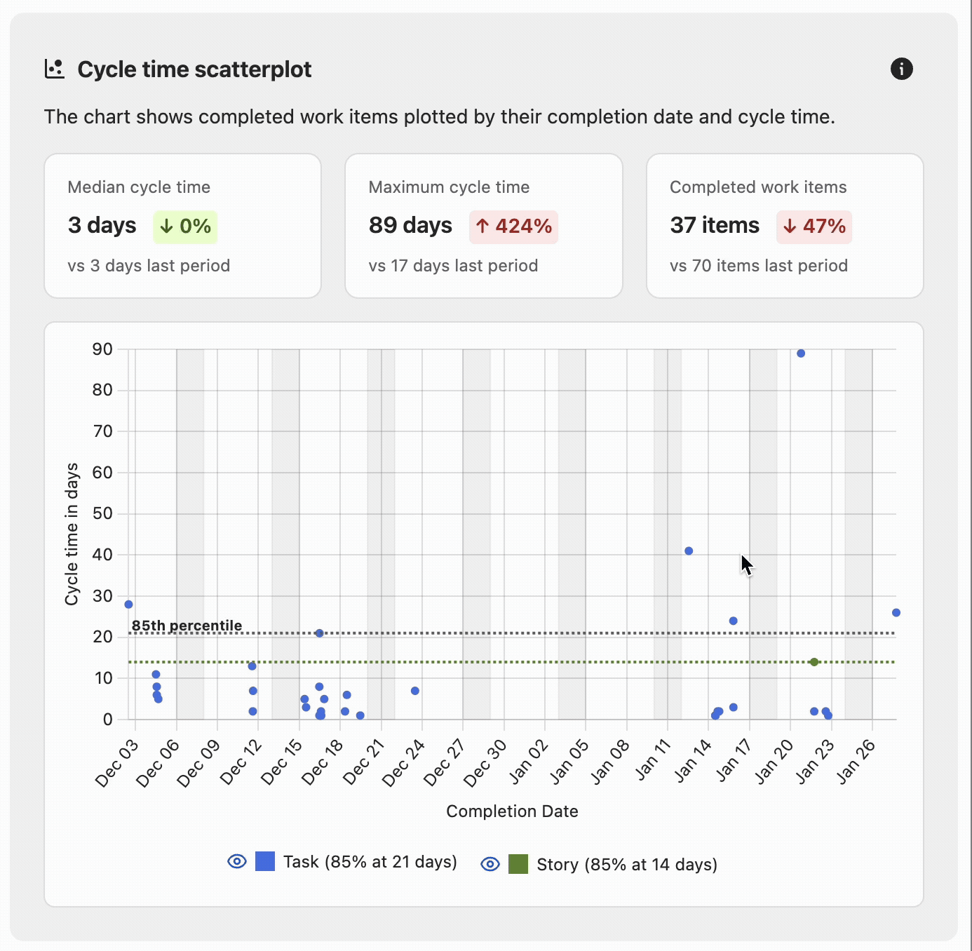
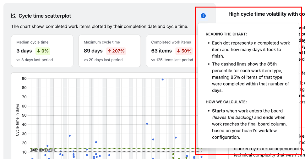
Cycle Time Scatterplot
The Cycle Time Scatterplot is the primary visualisation in Team Insights, showing the relationship between when work items were completed and how long they took.
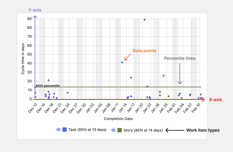
Understanding the Chart
-
X-axis (horizontal): Completion date
-
Y-axis (vertical): Cycle time in days
-
Data points: Each dot represents a completed work item
-
Colours: Different colours represent different work item types
-
Percentile lines: Horizontal dashed lines show the 85th percentile for each work item type
Key Metrics Displayed
-
Median Cycle Time: The middle value—50% of items complete faster, 50% slower
-
Maximum Cycle Time: The longest cycle time in the period
-
Completed Work Items: Total number of items completed in the analysis period
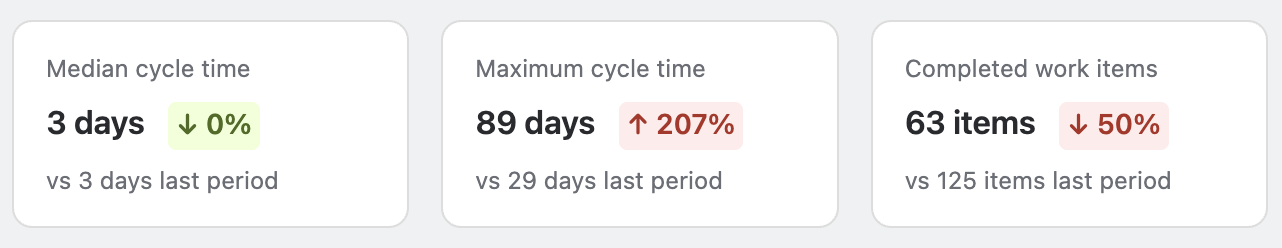
Interpreting Comparison Indicators
Each metric includes a comparison to the previous period, displayed as a coloured arrow with a percentage change.
-
Red upward arrow (↑) with percentage: Increase compared to previous period
-
Green downward arrow (↓) with percentage: Decrease compared to previous period
-
The comparison period matches your analysis period (e.g. if viewing "Past 60 days", it compares to the 60 days before that)
For cycle time metrics:
-
↓ (decrease) generally indicates improvement
-
↑ (increase) may indicate concern
For completed work items:
-
↑ (increase) generally indicates improvement
-
↓ (decrease) may indicate concern
Interactive Features
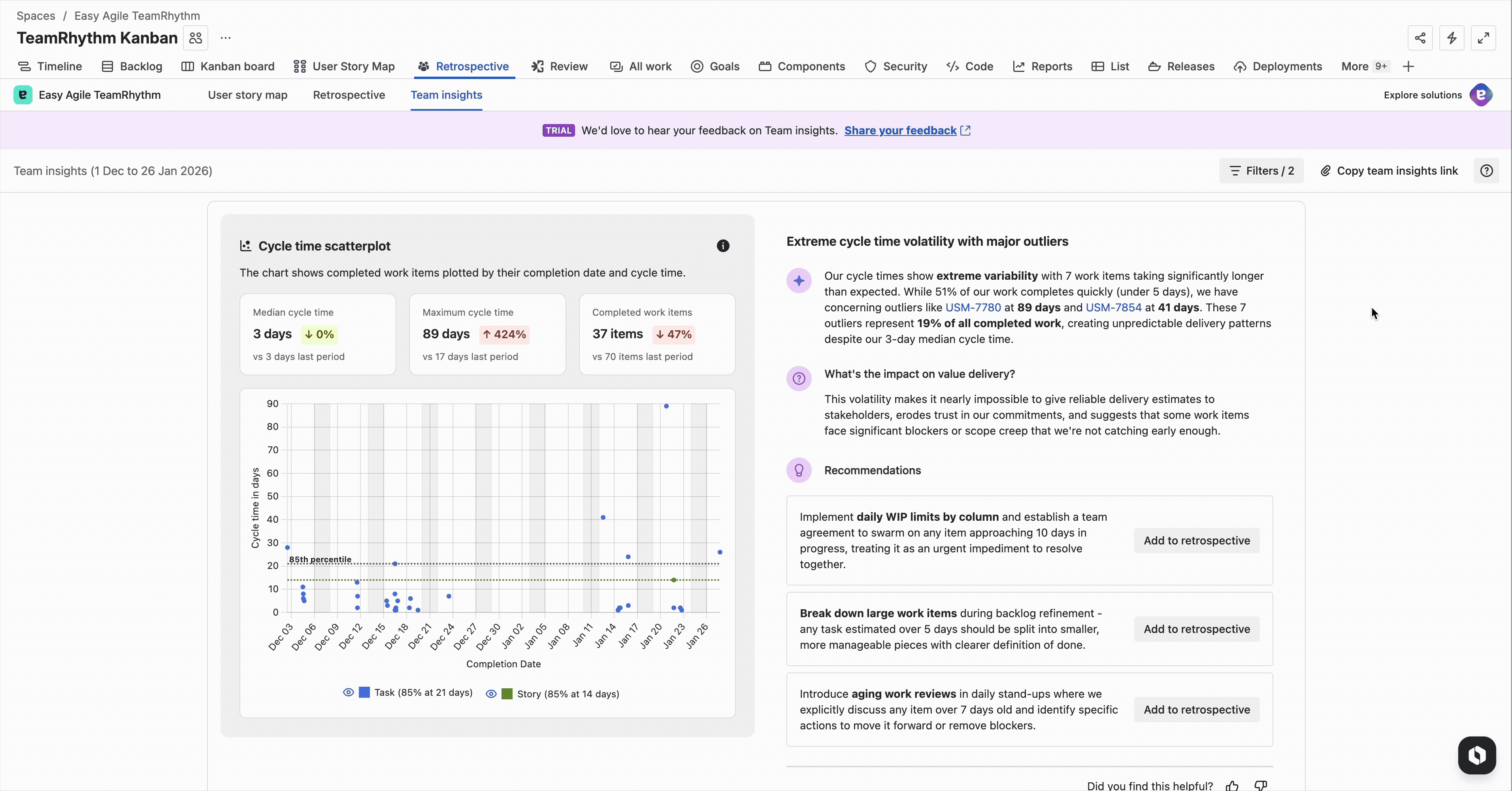
Hover over work item keys in insights: When you hover over a work item key mentioned in the insight text, the corresponding dot on the scatterplot is highlighted, making it easy to connect the written insight to the visual data.
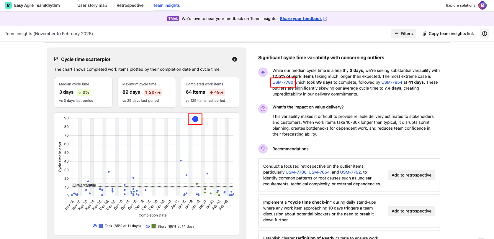
Hover over data points on the chart: You can also hover directly over any data point on the scatterplot. A tooltip appears showing the work item key and summary, so you can quickly identify what each dot represents without needing to click.
Click work item keys: Click on a work item key in the insight text to open the full work item details in a modal panel without leaving Team Insights. The detail panel shows the work item's description, subtasks, linked items, Confluence content, activity and comments, and a details pane with status, assignee, sprint, story points, and more.
Identify outliers: Work items significantly above the 85th percentile line are potential outliers worth investigating.
Throughput Chart
The Throughput chart shows how many work items your team completes each week over the analysis period.
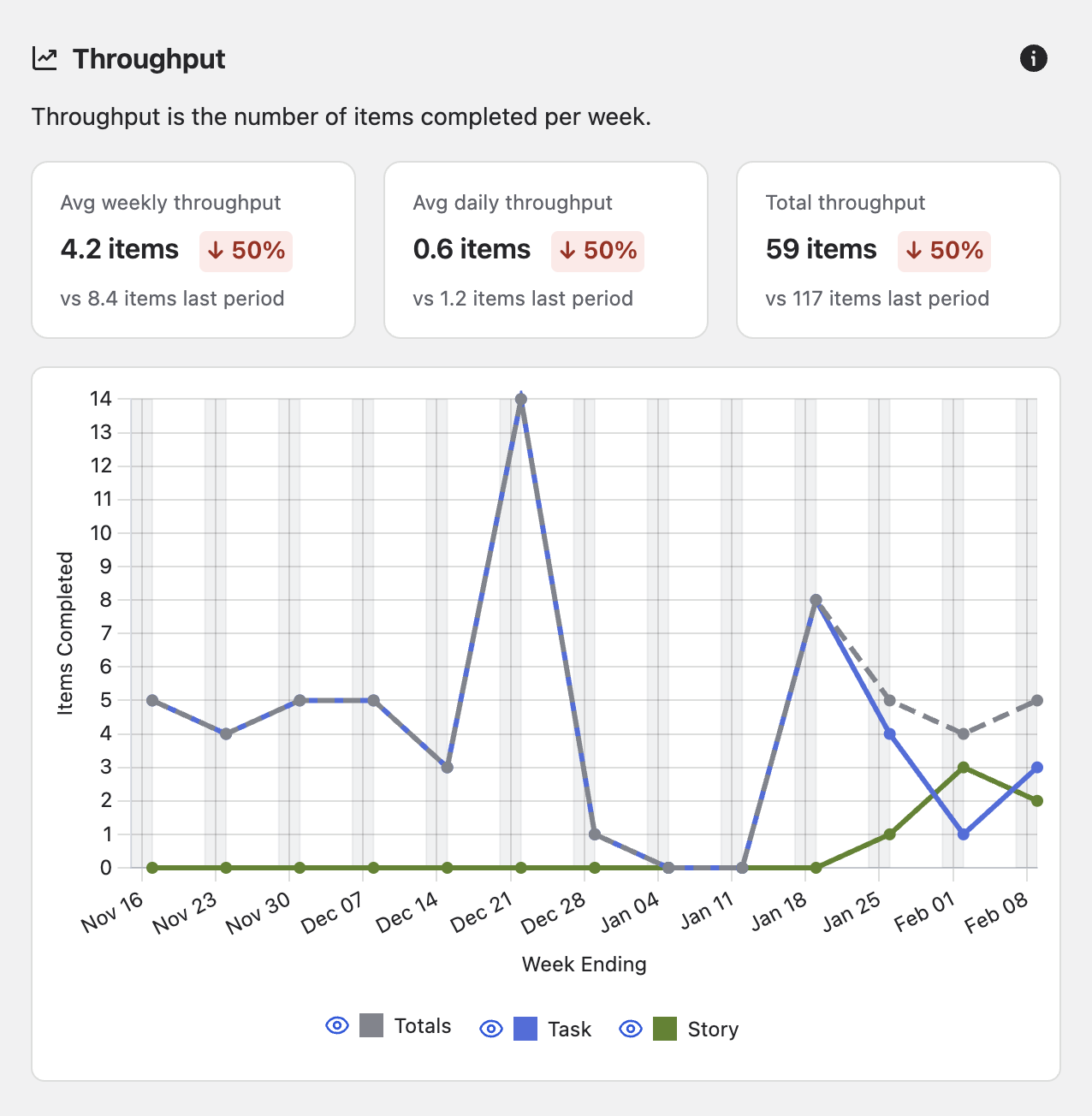
Understanding the Chart
-
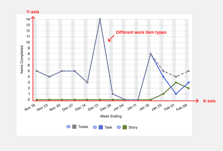
X-axis (horizontal): Week ending date
-
Y-axis (vertical): Number of items completed
-
Lines: Each line represents a different work item type
-
Line colours: Match the work item type colours used throughout Team Insights
Key Metrics Displayed
-
Avg Weekly Throughput: Average number of items completed per week
-
Avg Daily Throughput: Average number of items completed per day
-
Total Throughput: Total number of items completed in the analysis period
What to Look For
-
Trends: Is throughput increasing, decreasing, or stable over time?
-
Variability: Are there significant spikes or drops? These may correlate with team events (holidays, new team members, etc.)
-
Consistency: Stable throughput indicates predictable delivery
-
Work type distribution: Are you completing mostly bugs one week and mostly stories another?
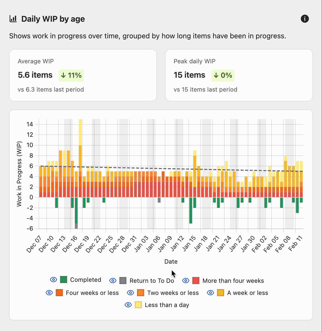
Daily WIP by Age Chart
The Daily WIP by Age chart shows how much work is in progress each day, segmented by how long items have been in progress.
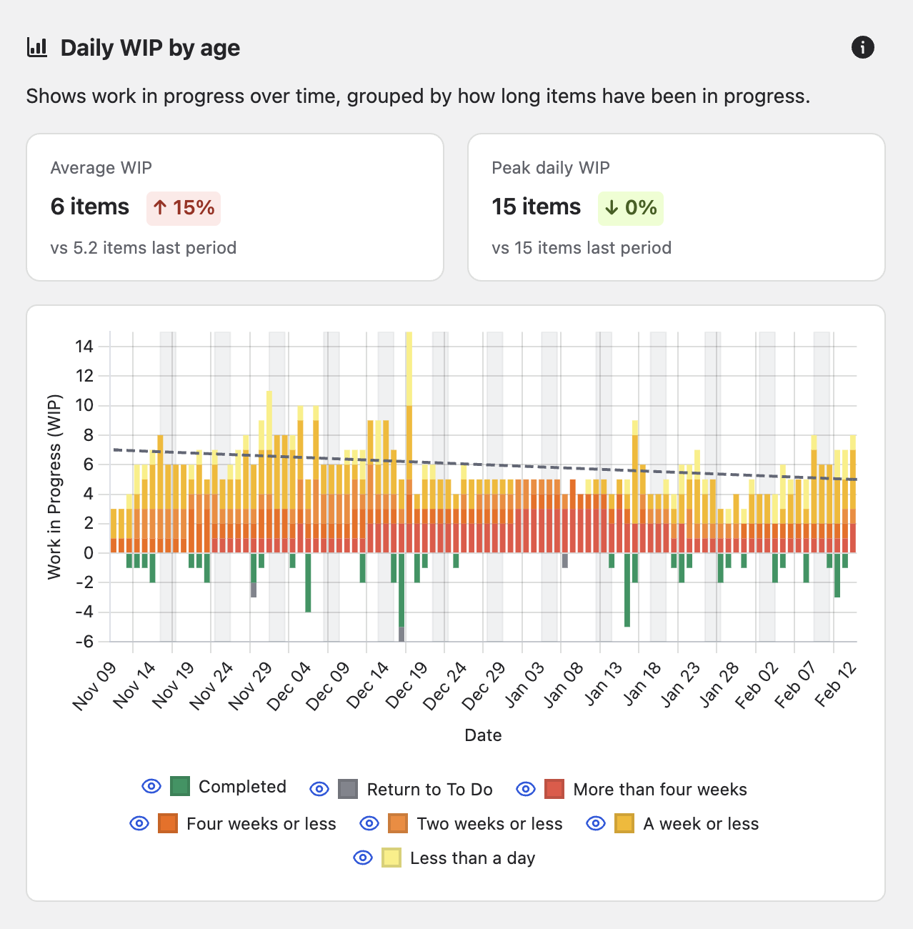
Understanding the Chart
-
X-axis (horizontal): Date
-
Y-axis (vertical): Number of work items in progress (can show negative values when items move backwards)
-
Stacked areas: Different colours represent different age bands
-
Tooltip: Hover over any date to see the exact breakdown
Colour Coding
-
Grey: Items returning to To Do
-
Green: Completed items
-
Red: Items less than a day in progress
-
Orange: Items a week or less in progress
-
Yellow: Items two weeks or less in progress
-
Light yellow: Items four weeks or less in progress
Key Metrics Displayed
-
Average WIP: Average number of work items in progress
-
Peak Daily WIP: Maximum number of work items in progress on any single day
What to Look For
-
WIP trends: Is work in progress increasing or decreasing over time?
-
Ageing work: Are items spending too long in progress (lots of light yellow)?
-
WIP limits: Is your WIP consistently above your team's intended limit?
-
Flow interruptions: Do items frequently return to To Do (green negative space)?
Interacting with Insights
Alongside each chart, you'll find AI-generated insights and recommendations.
Components of an Insight Card
Each insight card follows a structured layout designed to guide you from observation to action:
-
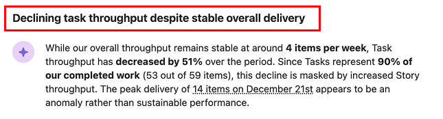
Metric headline: A bold summary of the finding, e.g. "High cycle time variability with concerning outliers."
-
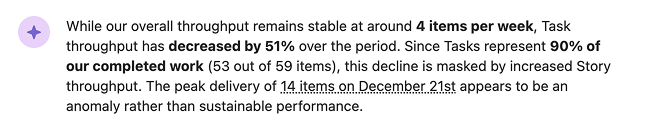
Metric observation: The detailed analysis text with highlighted work item keys that you can hover over or click.
-
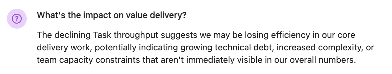
Impact on value delivery: A section titled "What's the impact on value delivery?" that explains the consequences of the observation, helping you understand why it matters and help you to prioritise accordingly.
-
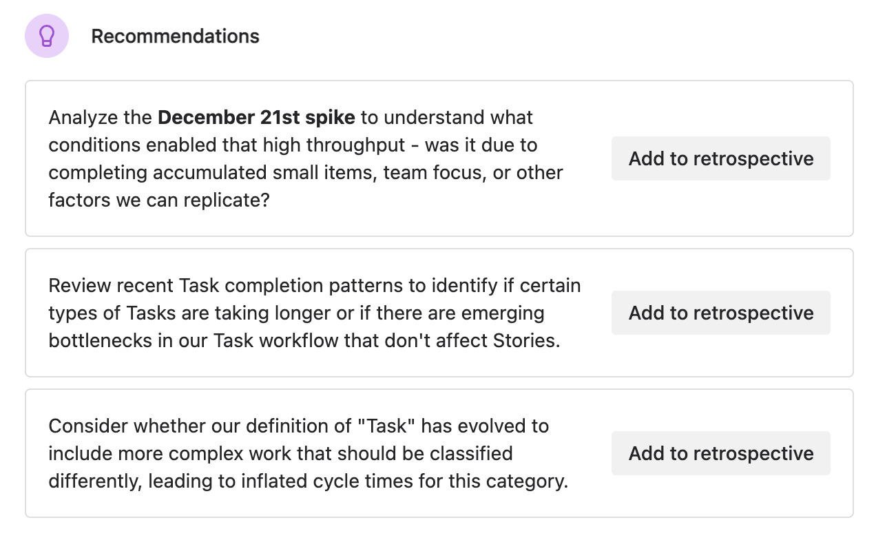
Recommendations: Specific, actionable next steps, each with an "Add to retrospective" button for quick capture into your team's retro.
Each section has an "i" for information which can be clicked to display definition tooltips that explain terminology like cycle time, percentiles, and how metrics are calculated.
Using Insights Effectively
Read the full insight: Don't just skim the headline,the details provide important context.
Investigate referenced work items: Click on work item keys to understand what made them outliers or noteworthy.
Consider the impact: The "What's the impact on value delivery?" section helps you prioritise which insights to act on.
Add to retrospective: Use the "Add to retrospective" button to capture recommendations directly in your team's retro.
Discuss as a team: Insights are conversation starters, not prescriptions. Discuss with your team to determine the best action or next experiment.
Tips for Chart Analysis
Look for patterns, not just points: Individual outliers are interesting, but patterns tell the story.
Compare across time: Use different analysis periods to understand if current performance is a trend or an anomaly.
Correlate with team events: Consider holidays, team changes, or process changes when interpreting charts.
Combine chart insights: Look at all three charts together—high WIP + low throughput + high cycle time = flow problem.
Use filters strategically: Apply work item type filters to isolate problems to specific types of work.